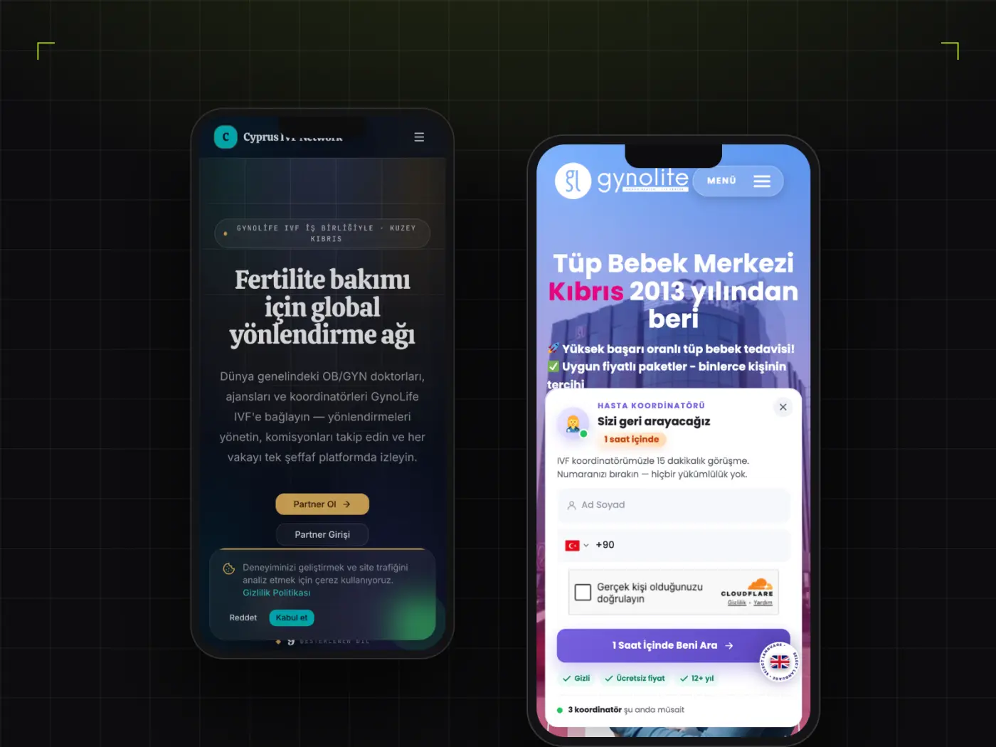
In a mobile interface, design's job is not to beautify the screen but to let people finish what they came to do in as few steps as possible. The first deliverable is therefore a flow, not a screen: where users enter, where they hesitate, and which step is genuinely necessary.
Screens are designed as a component library rather than one by one. Buttons, form fields, lists and notifications are defined together with their empty, loading, error and populated states — because in a real app most of the time is spent in exactly those in-between states.
The handoff is prepared so the development team can use it directly: spacing and sizing values, touch-target dimensions, state transitions and edge cases. Whether the design survives implementation depends on precisely this.