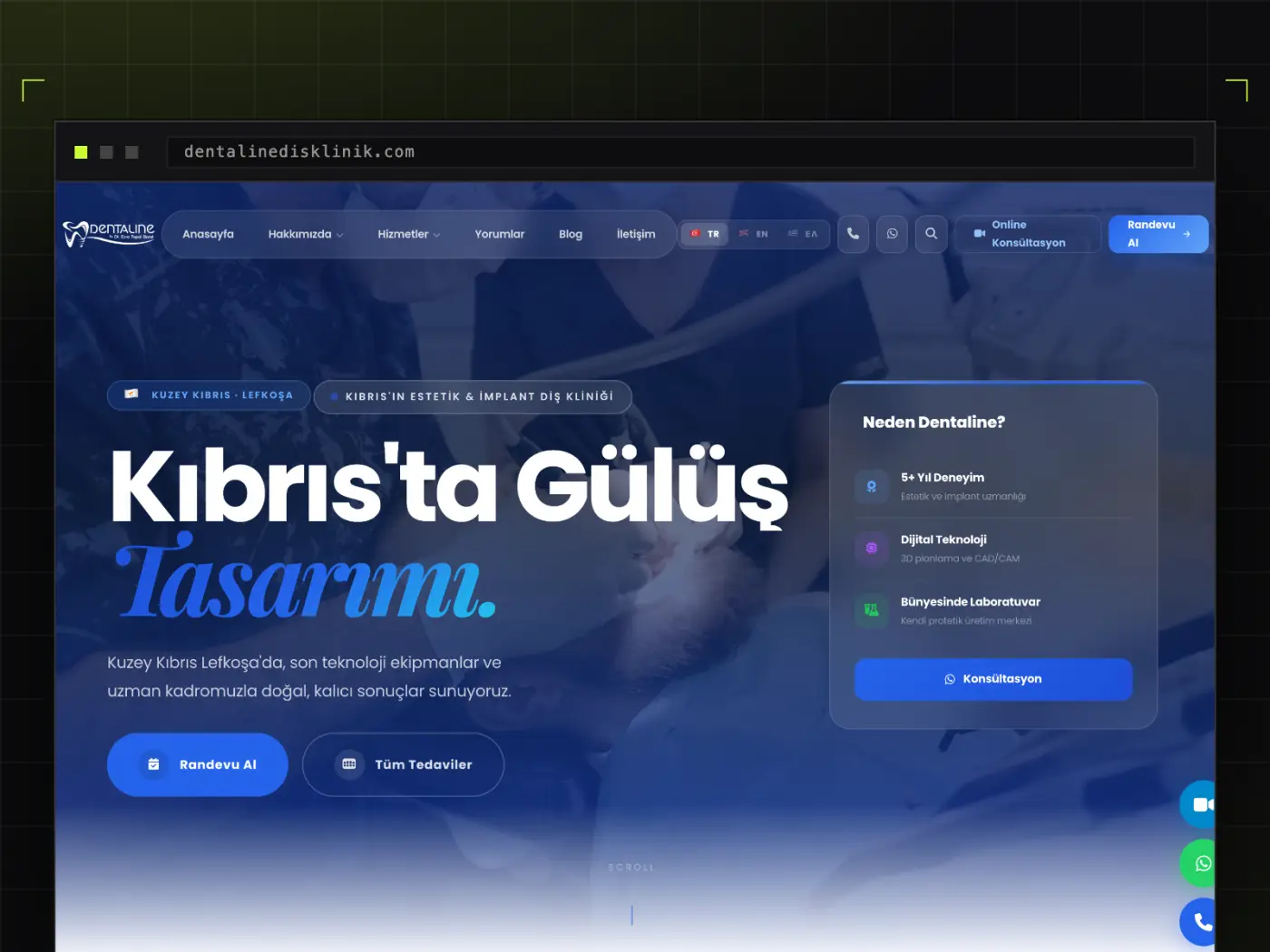
For healthcare brands, visual identity is more than an aesthetic preference: patients encounter the brand before they ever see the clinic, and often form their trust judgement right there. The work therefore began with positioning rather than a logo — who the clinic speaks to, and with what promise.
The identity was defined as a system: logo construction, typographic scale, colour palette and photographic language. Each element was decided by what it does in combination with the others, not in isolation, and edge cases (small sizes, single-colour print, dark backgrounds) were resolved up front.
Application rules sit at the centre of the delivery: dimensions, spacing and worked examples for signage, stationery, social media and digital interfaces. That lets the clinic's own team carry the identity forward without eroding it.