What separates Ankara's business fabric from other centres is the density of public institutions, professional chambers, associations and foundations in the city. Every project running with these bodies demands a formality inherited from official correspondence and tender culture.
The result: design's first test here is compliance before originality. The format, file size and page layout a specification asks for come before any design preference. A handsome file that does not match the specification is not even assessed.
1. The specification is an input, not a constraint
The order to follow when preparing a technical document: the institution's mould first, legibility second, visual preference last. Page numbering, heading levels, table format and appendix numbering are usually defined by the institution.
Reading that mould at the start is far cheaper than reformatting at the end. The most common loss is discovering after the design is finished that "the appendix must be a separate file" or "it must be A4 portrait".
2. Letterhead: more technical than it looks
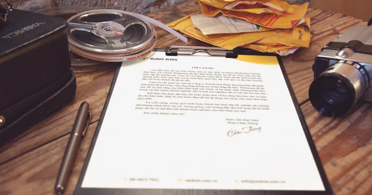
In institutional correspondence a letterhead is not decoration but a functional form. The signature and stamp area has to sit in the right place, top and bottom margins have to match the official letter mould, and the logo must not crowd the text.
There is a practical detail too: the same letterhead needs both a printed and a digital (template) version. Teams corresponding with institutions usually do not print — they fill it in on screen. The difference between the two versions shows immediately in the document that arrives.
3. Continuity matters more than creativity
The city's other leg is formed by defence and technology companies clustered around OSTIM and METU Technopolis, plus a wide university community. Here the counterpart is usually a technical team or a procurement unit.
What they want is not marketing language but verifiable, archivable information. The test corporate identity faces here is not creativity but continuity: the logo, the colours and the document still looking like they came from one source years later.
What delivers that in practice is not inspiration but record-keeping: colour codes, font versions and source files held in one place. On the branding and strategy side, the most requested output is usually exactly that — a guideline.
4. A different balance for associations and foundations
On the NGO and association side there is an extra constraint: budgets are limited and spending has to be justifiable. The approach that works is producing few but long-lived materials — a catalogue and business card system that lasts years rather than being reprinted for every event.
Practical details in a tender file
Compliance is usually lost not in the big design decisions but in small technical details. The headings that come up most: file format and maximum size, whether fonts are embedded, table and appendix numbering matching the institution's mould, and how signed pages are scanned back into the same file.
There is also version confusion. When several people touch a file before the deadline, which version was submitted can become unclear. A simple, effective safeguard: keep the date and version in the filename, and freeze the submitted version in its own folder.
Is working remotely a problem?
We do not have a physical office in Ankara; the team works from Nicosia. Design, corporate identity and web processes run entirely remotely. On the print side what decides the outcome is not proximity but getting production and delivery planning right from the start.
You can find how we work in the region and the questions clients ask most on the Ankara page.