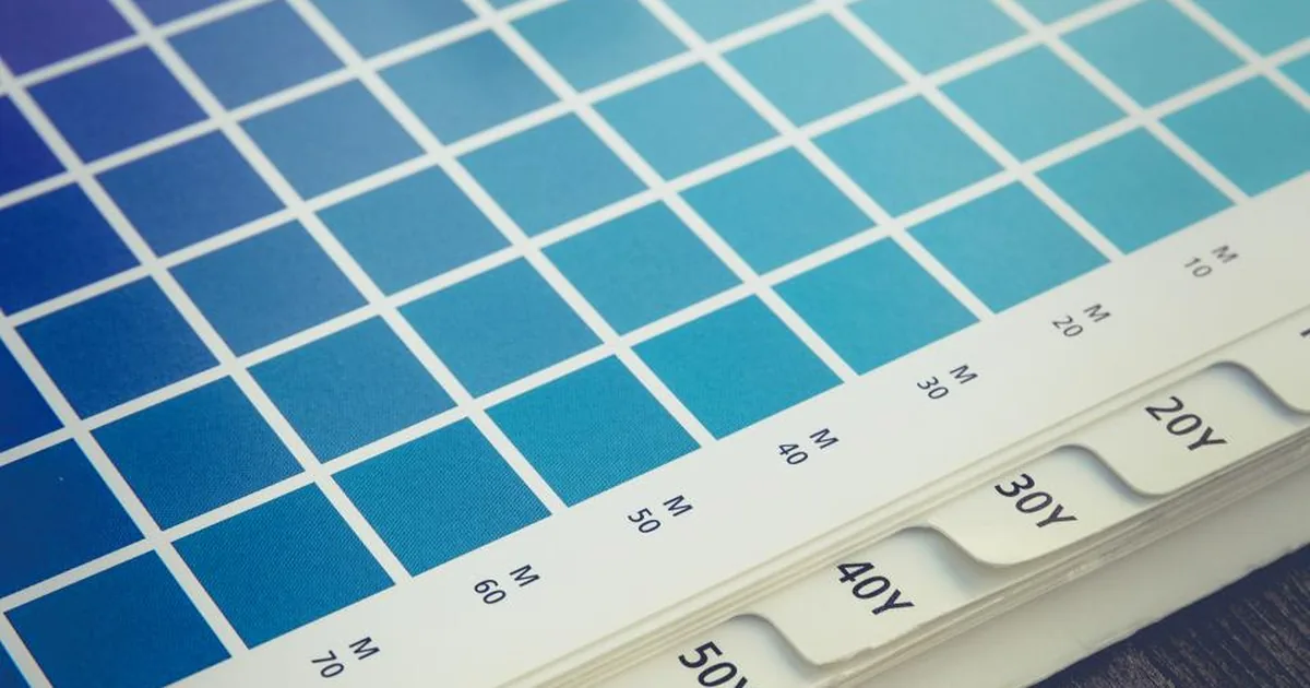
Design a bright orange graphic on screen, print the same file, and the colour that comes back is often duller or simply different from what was expected. That is not a printing fault — it is two different physical processes being compared. One produces light; the other reflects it. Any colour chosen on screen without understanding that difference carries a risk of surprise once it reaches the press.
Screens emit light, paper reflects it
A screen is visible even in a dark room because it generates its own light. It builds colour by layering red, green and blue light in different proportions; when all three shine at full strength, the result is white. This is an additive system: colour grows brighter as light is added.
Paper produces no light of its own. It absorbs part of the light falling on it and sends the rest back to the eye. Ink works like a filter that limits that reflection: cyan absorbs red, magenta absorbs green, yellow absorbs blue. Where all three overlap, the result should in theory be close to black; in practice it falls short, which is why a fourth, black ink is added. This is a subtractive system — colour grows darker as ink is added, not brighter. The same number of components working in opposite directions is the root reason a colour built on screen sometimes has no exact equivalent on paper at all.
Colours that exist on screen but not on paper
Every production method has a limit to the colours it can reach — this range is its colour gamut. A screen's gamut and a printed gamut are not the same shape; they overlap but do not coincide. The area where a screen is strong but print cannot follow clusters around three places: bright oranges, vivid saturated greens, and the neon pink-to-purple range. These come directly from emitted light, so they dazzle on screen; no physical ink combination reproduces the same saturation on paper.
Software then converts the colour to its nearest reachable equivalent — gamut mapping. What comes out loses the vividness seen on screen but stays consistent and usable. The issue is not that a colour prints "wrong"; it is that a colour which never existed in print is being approximated. A bright orange band behind a product photo in a catalogue, or a neon highlight on a poster, is where this limit shows up most often.
The paper itself is a layer of colour
Ink never works independently of the surface it lands on. Paper is not white; it carries a slight cast — cream, grey or blue — and ink sits on top of that base rather than erasing it. A blank area left on a cream stock reads as a warm, slightly yellowed white rather than pure white, a difference that stands out most on a spacious layout such as an invitation or a corporate report.
The paper's finish changes the same ink again. Coated stock is smooth and reflects light in a fairly narrow direction, so colour looks more saturated and sharp. Uncoated or matt stock scatters light more broadly, so the same ink leaves a softer, paler impression. The same design file can feel like two different jobs once printed on two different stocks — a run of labels looking off from a previous batch is often down to a change of paper rather than the ink.
Colour shifts again when the light changes
Whether a colour looks "right" also depends on what it is viewed under. Two materials that match perfectly in daylight — a packaging box and the label applied to it, say — can separate under a shop's fluorescent or LED lighting. This is called metamerism: two surfaces can reach the same appearance through different pigment mixes, but that equality only holds under one particular light spectrum. Change the light source and the pigments respond differently, and the eye no longer reads the two colours as identical.
This is why, once a corporate identity spreads across several materials — business cards, packaging, signage — the reassurance that "it matched on screen" is not enough on its own; where those materials are seen side by side, consistency needs checking under more than one light source.
When corporate colour is critical: spot colour and a physical proof
Four-colour printing approximates every colour through a mix of tiny dots; that works well for something as complex as a photograph, but leaves a small margin of tolerance where a single, fixed corporate colour is what matters. Spot colour — best known by the widely used Pantone system — skips the four-colour mix and prints that exact tone as one pre-mixed ink instead, so the same logo can be matched against the same reference number across separate runs, even at different printers.
No screen, however well calibrated, guarantees the final result on paper. Where a corporate colour cannot be allowed to drift — a logo, a letterhead set, a piece of signage — screen approval should not be treated as final; a printed proof needs to be seen physically, since it shows not just the colour but how the paper itself carries it.
What screen calibration fixes, and what it does not
Calibration keeps a screen internally consistent and faithful to a standard reference, such as sRGB, with brightness, contrast and white point measured regularly so they do not drift. That makes the same file look closer to identical across different screens — a genuinely useful step. But it does not turn a screen into a printing press; the screen still emits light, and paper still reflects it. A calibrated screen offers a "consistent untruth": an out-of-gamut orange still shows as a tone with no equivalent on paper, calibration or not. What calibration buys is predictability, not a match with paper.
The trap in black: flat black versus rich black
Black is produced two different ways in four-colour printing. Using the black ink alone, at full strength, is called flat black; it suits fine text and small type, because with only one ink involved, even the slightest misregistration during the run will not blur the edge of a letter. Rich black adds small amounts of cyan, magenta and yellow to the black, producing a tone that reads as deeper to the eye and stops a large flat black area from looking slightly grey under press lighting.
The problem is when the two get swapped. Apply rich black to small type and four separate inks need to land in perfect register; even a shift far smaller than a millimetre leaves a coloured halo — usually a faint blue or red tinge — around the edge of fine letters. The same error is barely visible on a large headline or a broad solid area. The rule is simple: small, fine type takes flat black; large, dark solids take rich black.
None of these differences are a printing defect — they are the natural result of screen and paper working under different physical rules. Knowing in advance where a colour is heading, onto a business card, a menu, a piece of signage, makes it possible to design against that surface's own rules and remove the surprise before it reaches the press.